
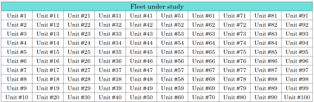
| Asset | 100 Jet Engines | |
| Dataset | Engine Unit info with 3 Operational Setting values and 21 sensors. (x100 Units) | |
| Dataset Explanation | The full dataset simulates the fleet of 100 engines to failure of one type (HPC Degradation). On-board sensor values are recorded once for each flight cycle. Training Dataset: 100 Units and Test Dataset: 100 Units. Min. Cycle of an engine is 128 cycles and Max Cycle is 368. Published by NASA CMAPSS, this dataset is based on physical models simulation & validated with real data. | |
| Objective | Identify units that are behaving abnormally (Anomalies) from the rest of the fleet. Assign Anomaly Scores to rank individual systems |
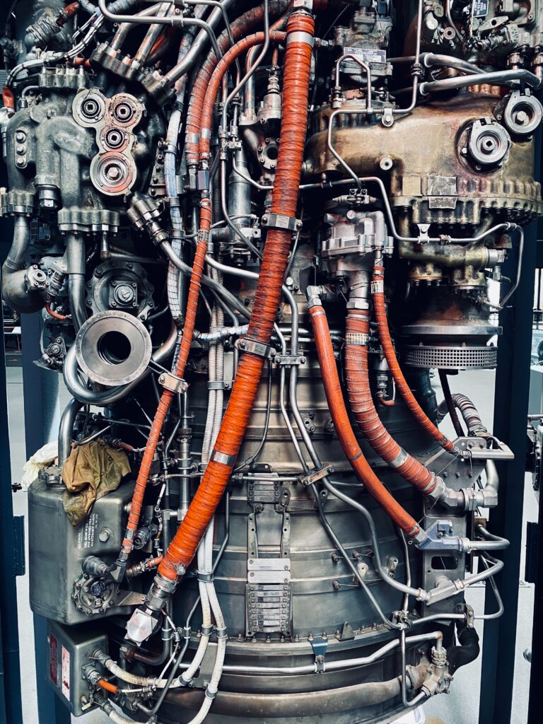
Before I explain the analysis, I’ll describe the system under study. It is an aircraft jet engine with onboard sensors. A simplified representation is:

Data from the onboard sensors are averaged out over each cycle and recorded as one-row entries. It is repeated until that Unit failure due to HPC Degradation. Each Unit from the fleet has the same sensor values recorded.

1. Data Visualization
Our goal is to identify the way in which the Engine Units fail due to this failure mode. The given dataset is split into a Training Datset of 100 Units and a Test Dataset of another 100 Units. We first load the Training Dataset.
We begin the investigation by visualizing all the sensors for all the Units to see if any clear patterns emerge. Since it is given that the failure mode is HPC degradation, only the sensors that have a correlation to its performance are chosen for analysis.

After choosing only 14 sensors out of 21 sensors, as others do not affect the Failure Mode under study. We plot all the readings for all the units on top of each other. Plot shows discernible trends, like LPCOutletTemp, HPCPutletTemp, and LPTOutletTemp all increase over time by usage. Whereas TotalHPCOutletPres, HPTCoolantBleed, and LPTCoolantBleed tags all decrease with time.

We know what Tags increase with time (number of flight cycles), what Tags decrease with time, and what Tags are constant or indifferent. This information allows us to narrow down the possible parameters for analysis but still doesn’t give us a single indicator to denote the Health of the System (Jet Engine). We need further analysis to reduce the dimensionality of the dataset.
2. Simplifying Dataset
Plots show us that different tags behave differently with time. Which Tag should we choose to further investigate? Should we choose all Tags or select a few? We can consider the SME expertise in downsizing the Tags for study but in complex equipment like a jet engine, the performance of one component will affect others. (like more bypass ratio means higher fan speed but less fuel consumption).
We need a way to capture all these interactions without losing knowledge. So, none of the tags can be eliminated further from the study, they can only be fused together to form a lower-dimensional dataset. One of the prominent ways of doing so in Machine Learning is Principal Component Analysis (PCA). It finds the axis that explains the maximum variance in the dataset. The axes that are orthogonal to the first axis will represent the second-highest variance in the dataset. The process is repeated until all the variance is captured. For our study, only the first 2 components is chosen as it represents more than 80% of the variance.

Now the 14-dimensional dataset can be plotted as a 2-dimensional dataset. The plot looks like below.

3. Analyzing Simplified Dataset
With a reduced dataset, does the plot show any trend on how the Engines perform as it ages with the operation? We can visualize it by plotting only the first reading (beginning of operation) and the last reading (engine failed) on all engines in the fleet. The above plot is removed from all points except the first and last readings.

First samples congregate at the left end of the PCA plot and the last samples (failures) are clustered at the right end. Meaning, during the course of operation the units degrade from the left end to the right end of the PCA spectrum. This is a valuable insight that is easy to monitor.

4. Setting up quick Anomaly thresholds
PCA plot in Section 2 gives a snapshot of all data points at all times. PCA plot in Section 3 gives a snapshot of how the points move over time. Based on just this information, we can set boundaries that will act as thresholds to detect when the Unit is reaching a failure point.
We establish 3 regions:
- Normal (Units operating good – No Maintenance required)
- Warning (Units approaching failure – Maintenance planning desired)
- Alarm (Units in failure region – Immediate Maintenance needed)

These thresholds are arbitrarily chosen to capture the needs of the Maintenance Team and the full behavior of the dataset. The method of deciding the boundary is heuristic with inputs from domain experts.
5. Evaluating Thresholds for Maintenance Teams
The above thresholds are evaluated to see how many readings are in each region.
“Alarm” region captures 5.6% of readings. “Warning” region captures 13.7 % of readings.
Above results show that the thresholds are sufficient for our analysis in that it is not classified as too many or too little of readings as Alarm. For Engineers operating these units, the next question is: What is the impact of these thresholds on Availability? Even though we established the thresholds posterior to the operation of engines we can backtrack it to see how much gain in Availability we would have gotten if we had these alerts in place. To compare, we need a default option. If we assume the established Preventive Maintenance rule is overhauling the system after 150 cycles, then if we followed the thresholds we would have:
“Gained 11.1.% of additional uptime if Maintenance Overhaul was done after Warning alert” “Gained 28.7 % of additional uptime if Maintenance Overhaul was done after Alarm alert”
The above numbers seem like a drastic improvement in Availability %. These are just numbers from looking at one variable: response time. It does not take into account the reality of Risk Management that organizations consider. They don’t want to wait till Alarm to risk a potential catastrophic failure. Other factors include repair time, operational schedule, personnel availability, etc.
Bar plot below shows the operational status of Engine Units 1 to 10 and its Alerts at various cycles during operation.

These thresholds are performing better for the operational data that was already recorded (and completed by Units). Can we use these same thresholds on new data that we have not analyzed before? How can we quantify the outliers in a way that will help Reliability & Maintenance team to prioritize tasks between Units that are in the same region? We use a machine learning method to get answers.
6. Thresholds from Machine Learning
One-class svm method is used to establish the boundary that separates normal data points from outlier data points. The method works by plotting all the data points and drawing a separation boundary that has the maximum distance between the points of different groups (normal and anomalous). Based on this we can estimate Anomaly Score. Score defines how far away from normal behavior the current reading is operating. Higher the score, anomalous the Unit.
Alternatively, we can monitor one Unit and track how the anomaly score progresses over time. Scores for two random units #3 and #5 are shown below. Unit is considered an “Anomaly” if the score is above 100 but the sliding scale is used to show the distance of a point to the classifying boundary.


7. Reliability Engineering
Similar Anomaly scores for all 100 Units can be calculated and then for any time ‘t’ we can rank the top 10 anomalous units that require investigation by the Reliability & Maintenance teams.

Tabulating the anomaly scores for just 10 units tells us how different units are ranking on top at different operational times. At time t = 20, Unit#9 has a high anomaly score. At time t = 70, it changes to Unit#6 and to Unit# 9 again at time t = 100. Finally, at time t= 150, Unit #6 exhibits a high anomaly. This is to be expected as Units wear out at different rates due to their inherent variability in Design and also Use conditions.
There are lots of interesting extensions that can be done to this analysis. Two extensions that are worthy of separate blog posts:
- Anomaly Scores for all Fleet Units can be calculated and plotted on a geographical map to show the top bad units for personnel at the Operations Control Center. Based on that, Maintenance Work Planning & Scheduling can be optimized.
- Calculate the Remaining Useful Life for all Fleet Units based on its Anomaly Score to give the Maintenance team a time frame to perform work before complete functional failure.
References:
- NASA PCoE
- User’s Guide for the Commercial Modular Aero-Propulsion System Simulation (C-MAPSS)
- Dataset
- MathWorks Predictive Maintenance Documentation
Related Posts

Demo C.3: Predicting Battery Life from health data
Demo A.3: Analysis of a Fuel Cell System